How to Extract a Design System from a Website
Overview
A design system lives in three places: in the designer's head, in the code, and on the page the browser renders. Only the last one is what users see. There are three ways to get it out of a live site. By hand in DevTools, which is how agencies did it for a decade and how I did it for client after client. From the codebase, when you have access. Or from the rendered page, by a tool that reads every element the way you would read five. This is what each one reads, what each one misses, and what it costs in days.

Where the by-hand pass starts: the head, and the favicon that names logo.png.
1. By hand, in DevTools
This is the primitive way, and it works. It is also a day for one page, and one page is never trusted: the pass is repeated on two or three pages before a value counts as the system rather than that page's habit, and across the marketing site, the app and the help centre when a brand has all three. Everything lands in a spreadsheet, a Notion page or a Figma frame by hand. And all of it rests on one person's DevTools fluency: a frontend developer who knows where Computed hides the rendered font and how to freeze a dropdown can do it, a designer or a product manager cannot, so the system stays locked behind whoever had the skill that week. Here is the pass, element type by element type, as I ran it.
Logo first
Cmd+Option+C, point at the logo, because the logo tells you which colour the brand means. An SVG is the good day: open it, copy the fills. A low-resolution PNG with a white background baked in is the bad day: someone cuts it out in Photoshop and it still ships soft at the edges, or you go looking for a cleaner copy in a stock library, another app the client runs, or the brand guide that arrives on Thursday. Sometimes the manifest icon under Application is the sharpest file the site has, because PWA icons are made at 512 pixels when the header logo was not. Cmd+P in Sources, type logo, and you see every file that matches.
Typography from a few key elements
The h1, one paragraph, a button label, a nav link. Computed tab, filter on font: family with its fallback stack, size, weight, line height, letter spacing. Rendered Fonts at the bottom says what actually loaded, which is not always what the stack asked for. Then p and h1 to h6 one by one, plus the bold and italic variants you happen to spot, and a skim of other elements for a second face. Sizes come back as pixels whatever the CSS said, so the ratio to the base is lost. Then the licence hunt: Google Fonts, Adobe Fonts, the foundry, and when nobody bought the face, an hour finding a lookalike with the same x-height.
Colours from :root
Select html, read the :root rule: the custom properties with a swatch beside each, sometimes two hundred of them. That is the palette as declared, not as used. A WordPress site declares every preset the theme ships, a Tailwind site the whole default scale. Which of them are on the page, and which one is the brand, the rule does not say. For that you go back to the logo and the primary button, read their computed colour, and search the block for the hex. Shift-click a swatch to cycle hex, rgb and hsl, one colour at a time; the eyedropper samples a pixel inside an image where no rule declared it.
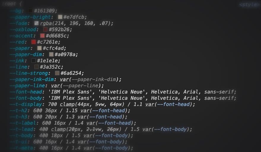
Declared in :root. Which ones the page uses, the panel does not say.
Spacing, which nobody got right
The box model shows one element's margin and padding, and a page has two thousand elements. You hover a few containers, write down 16, 24, 32, 48 and call it a scale. What you have is four samples of a system you never saw. The nearest thing to a method is reading the units: rem on multiples of 4 or 8 suggests a scale, px with 13, 17 and 22 does not. Whether the 24 on the card is the same token as the 24 on the section gap is unknowable from the panel.
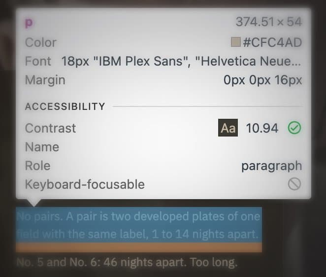
One paragraph, one margin. The scale needs the next hover.
Radius, borders, shadows, gradients
Judged by eye, then confirmed on a few exact spots: a button, a card, an input, an avatar. A site with 4, 8 and 9999 has a shape language; a site with 3, 5, 6 and 10 has had four developers. Border widths and colours the same way, and the border grey is almost never in the palette you copied. Shadows copied from Computed as the full box-shadow string, which for a layered shadow is a line nobody can read back. Gradients the same, angle and stops.
Components and their states
Button, input, badge, card, link, one at a time: every value in Computed into the sheet, then rebuild it and put the screenshot next to the original until it looks the same, at one size, on one screen. States come from Toggle Element State in the Styles pane: hover, active, focus, focus-visible, visited, target, ticked one at a time, values read again each time. Disabled and focus-visible are the ones nobody remembers, so the rebuild ships with the browser's blue ring where the original had a brand one.
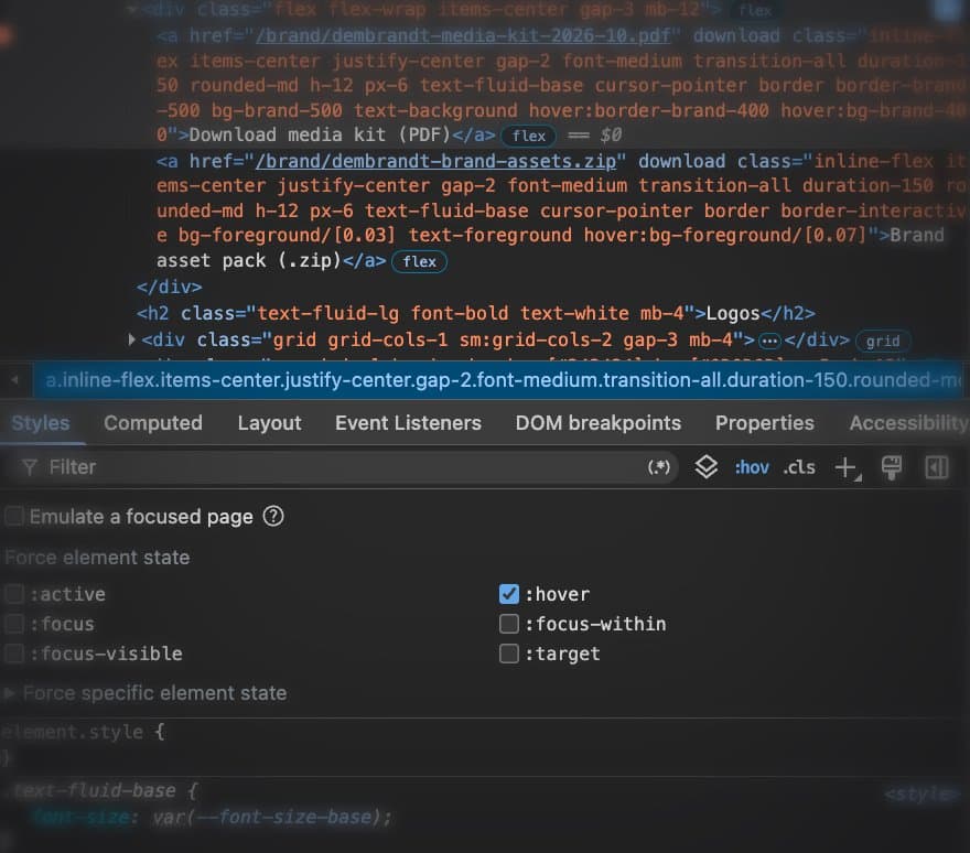
One state, one element, one tick at a time.
What closes when you click away
A dropdown is gone the moment you move to DevTools. The trick is a DOM breakpoint: select the parent node, Break on, Subtree modifications, open the menu on the page, and the debugger freezes it on screen for you to read. Ten minutes per menu. Motion has its own panel, Cmd+Shift+P, Show Animations, which records every transition with its duration and easing, per interaction you remembered to trigger.
What the sheet never contains: which of the two hundred colours are the system and which are one-offs, because the panel shows what one element uses, not how often anything is used. The rem scale, because Computed shows pixels. The token names, because a variable shows its resolved value. And the day the site changes, the sheet is wrong and nobody reruns a day of work to find out where.
2. From the codebase, or a CSS statistics tool
With repository access, open the tokens file, the Tailwind config, the theme, the SCSS variables. That is the system as it was designed, and it is the honest shortcut when you can take it. It is not the system as it ships: a token nothing references, a component library with its own hardcoded values, a page that overrides the theme inline, a dark mode started and never finished. The code says what was meant. The page says what is there. The difference between them is most of the work.
The code gives you
- Token names, when someone named them
- The intended scale: rem values, spacing steps, the type ramp
- Variants and states that were defined, used or not
The code does not give you
- Which tokens a user ever sees
- Overrides and local exceptions
- What it looks like once fonts, images and hydration have landed
Without access, CSS statistics tools read the stylesheet. Every declared value counts once, whether it is used on every page or on none. A Tailwind site comes out as the framework's whole default scale, a WordPress theme as every preset it ships. Hover and focus are in the file, but nothing says which element they belong to or whether that element exists. I rarely reached for them; the inspector told me more, slowly.
Two things people reach for here are not extraction at all. A plugin that imports a page into Figma gives you layers, which is a picture of the structure with no tokens, no states and no scale; that is cloning, and it has its own method. And a token manager inside the design tool is where tokens go once you have them, not where they come from.
3. From the rendered page
The third way is the first way done by a machine, on every element instead of five. A headless browser opens the page, waits for hydration and fonts, and reads the computed style of everything on it: colour, type, spacing, radius, border, shadow, gradient, motion. It hovers and focuses what can be hovered and focused, so states are read, not remembered. It reads the :root variables and checks which ones the page actually resolves to, so a preset nothing uses does not become a token. It counts: a colour on 40 percent of elements is structure, a colour on the logo and the primary button is the brand, and the sizes that recur form the scale while the one-off 17px stays a one-off.
What makes it more than a faster spreadsheet is that every choice carries its reasons. The primary colour is not the most common one; it is the one that won on evidence, and the output says which: on the logo, on the call to action, declared as --brand, with the runner-up listed and why it lost. You can disagree with the pick and still use the data, because the data is not the pick. Run it on three pages and tokens are merged by how many pages use them, which is the two-or-three-pages pass from method one, done every time instead of when there was budget.
What it does not do, so you know where the day's work still is. It reads what the browser renders: content behind a login needs the session handed to it, text drawn into images or canvas is not text, and a page that builds itself on scroll is only as complete as the scroll it was given. It returns rendered pixels and infers the rem scale from them; it does not read your source. It picks a primary and says how sure it is; on a monochrome brand or a site with two equal accents it will be unsure, and it says so rather than pick quietly. And it is one site at a time: the cross-site pass is one command per site.
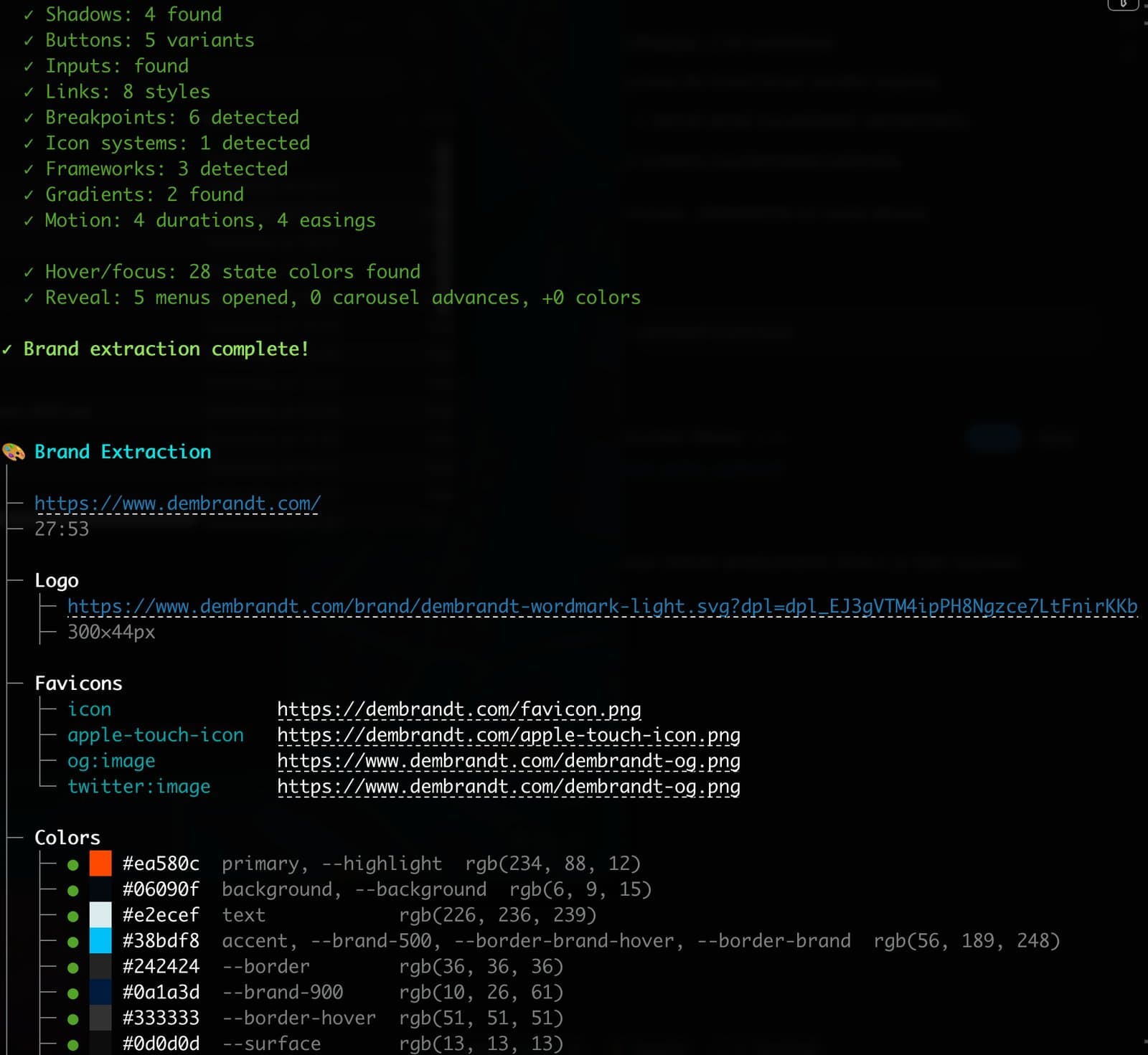
Same site, one command, 28 seconds. Every colour arrives with its role.
Run it
Out comes the system as the page ships it: W3C design tokens, a DESIGN.md an agent can build from, a report you can read, and the evidence behind each pick. Run it again after the next deploy with --compare and the difference is a number. The spreadsheet never had one.
Related
Getting started
Install Dembrandt and turn any public website into a complete set of design tokens in under 2 minutes. All you need is Node.js and a terminal.
WorkflowClone any website
AI cloners give you a lookalike. Capture the rendered state, extract the tokens, rebuild section by section, then verify with a diff. Eleven steps that replace eyeballing with measurement.
Design SystemsToken drift
Design tokens drift quietly between releases. A color shifts, a spacing value disappears, a border radius changes. Nobody notices in the moment. Here is how a baseline-based approach catches it before it compounds.