Where design systems are heading, and where yours is now
Overview
Design systems are in a second golden age. The first one proved the idea and priced it out of reach: a real system meant a dedicated team and a budget to match, so most companies settled for a PDF and hoped. Agentic coding removed that bill, and quality stopped being a function of what you could spend. This is how design got here, the five levels of brand adoption it produced, and what the last one changes: when agents ship interfaces faster than anyone can review them, following the brand stops being something you approve and becomes something you measure.
How it got here
- 1845Tiffany fixes one turquoise for every box it ships
- 1907Behrens puts AEG's architecture, products and print under one master plan
- 1950sCCA and IBM write the first strict visual manuals
- 1963Pantone indexes colour into discrete numbers two printers can agree on
- 1996CSS arrives, and values get hardcoded page by page
- 2014Design systems become the default way large products get built
- 2018Style Dictionary and W3C DTCG turn guidelines into cross-platform JSON
- 2026DESIGN.md turns the guideline into a file an agent reads before it writes
- NextThe brand is measured on every surface that ships
Every step is the same instinct: pin the brand to something that cannot be argued with, then make it reach further. What changed is who reads it at the other end.
Brands were tokenised before computers existed
In 1845 Charles Lewis Tiffany decided that the company's products would always be packaged in one particular turquoise. Not approximately that one. That one. The shade is registered today as Pantone 1837, and it still works the way it always has: the color of the box says what is inside before anyone has read a word of it.
That is a token. A named value with one accepted implementation, and a binding agreement not to depart from it.
Peter Behrens' work for AEG from 1907 onwards took the idea from a single color to a whole system: the logo, the products, the buildings, the advertising and the typefaces under one designer. It is generally treated as the starting point of corporate identity.
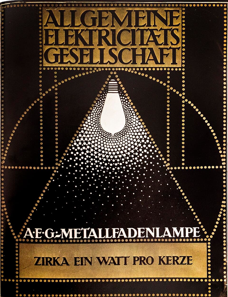
Actual brand guidelines only appeared in the 1940s and 1950s, and three things drove them at once.
Mass media. Television and color printing demanded that the same brand looked the same across entirely different production processes.
Chains and franchises. With hundreds of locations, a local employee had to know exactly what the store was meant to look like. A rule book was the only way to tell them.
Operating across borders. An ad made in New York and one made in Tokyo had to be recognisably the same brand, without anyone seeing both.
Container Corporation of America assembled strict visual rule sets for its designers as early as the 1940s. In the 1950s IBM began the overhaul under Eliot Noyes that produced the best-known design guidelines in the field. Lufthansa made its own.
The contents of those books were technically the same thing as --color-brand-primary. A CMYK value, a Pantone code, a RAL number and a HEX string are one idea on different substrates: a fixed value, named so that it can be referred to.
From a book to an interface
Digital development did not invent tokenisation. It changed the storage format from a book to a file, and two things changed with it.
First, the value stopped being an instruction and became executable. A HEX code in a brand book was something a person copied by hand. A CSS variable is something the browser reads.
:root {
  --color-brand-primary: #0055ff;
  --font-family-base: 'Inter', sans-serif;
  --spacing-unit: 8px;
  --spacing-md: calc(var(--spacing-unit) * 2);
}
Second, tokens acquired layers. A HEX code alone is not enough, because it does not say what the value is for. The current model separates three levels.
- PrimitiveThe raw value. blue-500 = #0055FF. This is the Pantone code.
- SemanticThe purpose. bg-interactive = var(--blue-500).
- ComponentBinds the value to one part of the interface.
The layering is what makes theme switching possible at all. When a component asks for bg-interactive instead of a hard-coded blue, adding a dark mode is a swap of the token map rather than a sweep through a thousand files.
Color spaces moved on at the same time. OKLCH and OKLAB produce perceptually even ramps and computable contrast in a way RGB and HEX never bend to. Spacing stopped being arbitrary pixels and became a scale: space-1 is 4px, space-2 is 8px, space-4 is 16px.
| Era | Format | What the value was |
|---|---|---|
| 1800s | Seals and pigments | A pigment |
| 1950s | Pantone, CMYK, manuals | A value on a printing surface |
| 2000s | HEX, RGB, CSS | A fixed pixel value |
| 2010s | CSS variables, themes | A code variable |
| 2018 on | Style Dictionary, W3C DTCG | A portable file |
| 2020s | Design tokens and agents | A cross-platform system |
One JSON file now feeds a brand's colors, fonts and spacing to the website, the iOS app, the Android app and Figma at the same time. The brand book became an interface.
The breakthrough, 2014 and 2015
Design systems moved from a niche practice to an industry standard on the back of two releases. In 2014 Google published Material Design, the first genuinely large system that put a visual language, motion, accessibility and shipped code components in one package. In 2015 Salesforce open-sourced the Lightning Design System and showed the same model scaling to enterprise software.
The tools changed alongside them. Figma passed Sketch and Adobe because it brought components, variants and real-time collaboration into one file, and it has held the design end of the pipeline ever since. On the engineering side Storybook became the standard for documenting and testing components.
Open systems set the example for everyone else: IBM Carbon, Shopify Polaris, Microsoft Fluent, Airbnb's Design Language System.
Theory followed practice, 2016 and 2017
The large systems shipped first and were explained afterwards. Three writers gave the field the vocabulary to talk about them.
Brad Frost's Atomic Design mapped interfaces onto chemistry: atoms are colors and type, molecules are a button and an input together, organisms are navigation, and only above those sit templates and pages. The hierarchy itself mattered less than what it did to designers' thinking. They stopped drawing pages and started building the parts a page is assembled from.
Alla Kholmatova's Design Systems moved the focus from code to organisation. The argument is that a design system is not a component library but a shared language and a way of working, and that the library is merely the part of it that happens to be machine-readable. Most failures are failures of that side, not technical ones.
Nathan Curtis and EightShapes brought the governance models: who owns the system, how a change is approved, and when a centralised model should give way to a federated one where product teams contribute back. A large share of how tokens are named and layered in practice comes from the same direction.
Standards made tokens portable, 2018 on
As long as every organisation invented its own token format, tokens went nowhere. Two things fixed that.
Style Dictionary, Amazon's open source tool, compiled one JSON file into CSS, Swift and Kotlin automatically. One source, many platforms, without anyone maintaining three parallel truths. It transforms tokens; it does not check what became of them.
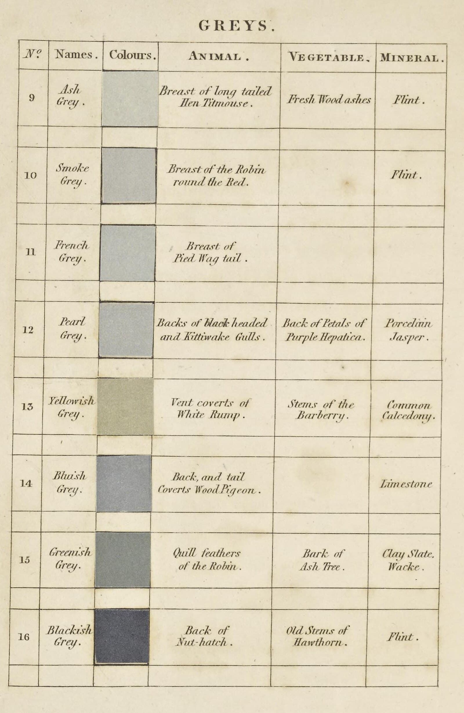
The W3C Design Tokens Community Group turned the same idea into a standard. DTCG defines a platform-independent JSON format that Figma, translation tools and target platforms all understand, strict enough that a file either validates against itor does not. From that point a token stopped being one team's internal agreement and became a portable file.
Who does this work changed at the same time. The chain ran from graphic designers and ad agencies to UX and UI designers, and from there to a role that did not exist before: the design system engineer, standing between Figma and React, responsible for making both speak about the same token. The source of truth moved out of the visual guideline and into the code.
The five levels
The peculiarity of digital products is that a brand book is never enough to build an interface. It does not say what happens in an error state, what an input looks like on focus, or how an empty view behaves. For twenty years those decisions have been made by graphic designers, ad agencies, UX designers, frontend developers and product designers, each on their own logic. Brand, guidelines, design system and component library are four different things people call by each other's names, and brand adoption sorts into five levels.
- 0
Ad hoc
Everyone picks type sizes, margins and colors by feel. The buttons carry five shades of blue and three corner radii. Debt accumulates fast and the experience is fragmented.
- 1
A manual guideline
The brand book is a PDF or an intranet page. Developers copy HEX codes by hand. A person is the bottleneck, the guideline goes stale, and nothing stops anyone writing
margin-top: 17px. - 2
A context file
The rules are condensed into text at the root of the repository, a DESIGN.md or a theme.json. The file tells both the team and the agent which colors are used, what the spacing scale is, and how error states are expressed.
- 3
A full design system
The brand is code and interactive components. Tokens sync between Figma and the repository. A developer does not build a button, they import one. It needs a team to maintain the library, the documentation and the accessibility work, which is the part most first attempts underestimate.
- 4
Agentic design
The component library and the tokens are consumed primarily by an agent. The brief is a need, not an implementation: build a settings view where someone can manage payment details. The agent assembles it from parts the system already has, and checks contrast ratios and accessibility as it generates. This is what an agentic pipeline does to design work.
Why DESIGN.md appeared in the middle
Level 2 is new. It did not exist before agents, because a written agreement had no reader that would follow it automatically.
Standing up a full design system takes a monorepo, package publishing, versioning, Figma sync and continuous maintenance. A DESIGN.md is one file at the root of the project. It returns much of the benefit for a fraction of the work, and it reads as easily to a new developer as it does to a model being handed a context window.
Without it the agent works blind. The output is generic code that functions but does not look like the product. With the file, the agent knows the limits before the first line: the primary is --brand-500, spacing comes in multiples of eight, the radius is always the same, error messages are short.
Vercel took the obvious next step and published theirs. Request vercel.com/design.md and you get forty kilobytes of markdown back, served as text/markdown, with a frontmatter block naming it so an agent can load it straight in. It is not a token export. It is instructions for how to design as Vercel, and it points at a separate stylesheet for the actual values. Their own write-up, how our agents build on-brand pages with design.md, explains what they use it for.
The pattern in that URL is more interesting than the file. Crawlers learned to look for /robots.txt, models are learning to look for /llms.txt, and there is no reason design should be the exception. If /design.md settles into a convention, then any agent working against any domain can ask that domain how it is supposed to look, without a login, a plugin or a handoff. The brand book stops being something you are given and becomes something you can fetch.
It also inherits the weakness of every guideline that came before it. A published /design.md says what the brand intends. It does not say whether the page served from the same domain, seconds earlier, actually did any of it.
This inverts the order of the work. It used to run from brand workshops to a two-hundred-page PDF to years of implementation before a component library existed. Now the code or the prototype comes first, the tokens are read out of it, the agent produces work that matches them, and a component library grows only if there is a need for one.
A brand guideline became an hour of work. Following the brand is no longer a question of company size, restricted to those with a team assigned to it.
Governance at scale
The maturity model quietly assumes the system is followed, and the gap between intent and reality is where that assumption breaks. At a small scale that holds, because somebody has time to look. At a large scale it is a fiction, and the fifth level makes it less true than before.
The first reason is the number of surfaces. A large brand's digital look is not one product. It is the marketing site, the product itself, the documentation, the emails, partner portals, embeddable widgets, country sites, campaign pages built by agencies, and products that arrived through acquisitions with a history of their own. In most organisations nobody can list them all, let alone say what they look like today.
The second is ownership. The brand team controls Figma and the token file. Nobody controls the result. The whole implementation chain sits in between, and the further you go from the core product, the less access there is: you cannot see the agency's repository, the acquired team does not report to brand, and the partner's implementation is invisible until it is in production.

The third is speed. Agentic production means interfaces appear faster than anyone can review them. Approval-based governance is already a bottleneck. It does not scale at all to every team generating views with an agent.
Governance moves from approval to measurement.
The question is no longer whether someone approved this design, because there is neither the time nor the authority for that. The question is whether the published surface matches the agreed token set, and if it does not, how far off it is. That is answerable without repository access, without the team's cooperation and without anyone opening Figma, because it is read from what is already public. It is the same reading the Explorer runs against brands you know: the rendered page.
Three things change in practice.
The unit
Conformance is a number, not an opinion. Deviation per surface, per release, as a time series. It can be shown as a portfolio view where forty surfaces sit on one scale.
The nature of an exception
Once deviations are visible they turn into decisions. A campaign page is allowed to differ because that was decided, not because nobody noticed. Governance starts defining where deviation is permitted, not only what is forbidden.
The role
The brand owner stops being a gatekeeper and starts operating a measurement system. The work is calibrating alerts and negotiating the limits, not reviewing every view.
In fairness, it has to be said what measurement does not solve. Conformance does not tell you whether the design is any good. A page can use every token correctly and still be confusing, ugly or the wrong answer to the problem. Measurement is a floor, not a ceiling. Tuned too tight it produces a sameness nobody asked for: if every deviation is an error, the system stops developing and the brand freezes into whatever it happened to look like when the gauge was set.
Governance at scale is therefore two things at once. Automatic measurement of what has been agreed and can be measured, and a human decision about what is allowed to change. The first scales mechanically. The second does not scale at all, which is why it is worth saving for the few places where it matters.
Where to start, and where it goes
The first step is smaller than the model makes it look, because level 2 does not have to be written by hand. Point the Dembrandt CLI at a URL and it reads the rendered page and writes the context file for you. No repository, no Figma file, no permission from the team that built it.
npx dembrandt your-site.com --design-md --dtcg
That is one run from level 0 or 1 to a level 2 context file, plus the same tokens as W3C DTCG JSON. It is descriptive, not aspirational: it says what the site does today, which is the only starting point that cannot be argued with. The quickstart covers the rest of the flags, and the same extraction is available to an agent through the MCP server.
The step after it is the one this article has been arguing for. Pin that extraction as a baseline and run the comparison on every deploy. It exits 1 when the tokens move, so drift fails a build instead of shipping quietly, and the drift gate recipe wires it into CI. That is the measurement half of governance, running without anyone being asked to review anything.
The end state is the row this page opened with. A brand that can be fetched: a token file and a context file published at a known path on your own domain, regenerated from what actually shipped rather than from what was once agreed, and checked against the live page often enough that the two cannot drift apart in silence. Dembrandt generates those files and scores that gap. Publishing them is yours, and it is the part that turns a brand book into an interface.
Continue reading
DESIGN.md
DESIGN.md is a readable hint, not a token. It works for prototypes and solo projects. Real design systems need structured, machine-readable token schemas that survive across tools, platforms, and team sizes.
Brand to Design System
The same hierarchy diagram - brand, design guidelines, design system, component library - tells completely different stories depending on who is reading it. A consultant, a developer, a visual designer, and a marketing lead all see a different centre of gravity.
Token drift
Design tokens drift quietly between releases. A color shifts, a spacing value disappears, a border radius changes. Nobody notices in the moment. Here is how a baseline-based approach catches it before it compounds.