Brand, Design System, Component Library: Two Ways to Read the Same Hierarchy
Overview
Brand, design guidelines, design system, component library. Four concepts arranged in a hierarchy. Ask a marketing lead, a visual designer, a UX consultant, and a frontend developer to describe the relationship between them and you will get four genuinely different answers - all of them correct from where that person is standing. This article maps those perspectives and explains why naming yours is the first step to a productive conversation with anyone who holds a different one.
1.The same diagram, different centres of gravity
Put four concentric circles on a wall. Label them Brand, Design Guidelines, Design System, Component Library. Add a horizontal bar across all of them labelled Component Library - the thing that cuts through every layer simultaneously. Now ask a room of mixed professionals which circle is the most important one.
You will not get consensus. You will get a very accurate map of how differently people understand their own work - and why cross-functional design conversations so often stall on definitions rather than decisions.
The two most common readings of the hierarchy are not opposites. They are the same structure viewed from different ends of the organisation. Understanding both is more useful than arguing about which one is right.
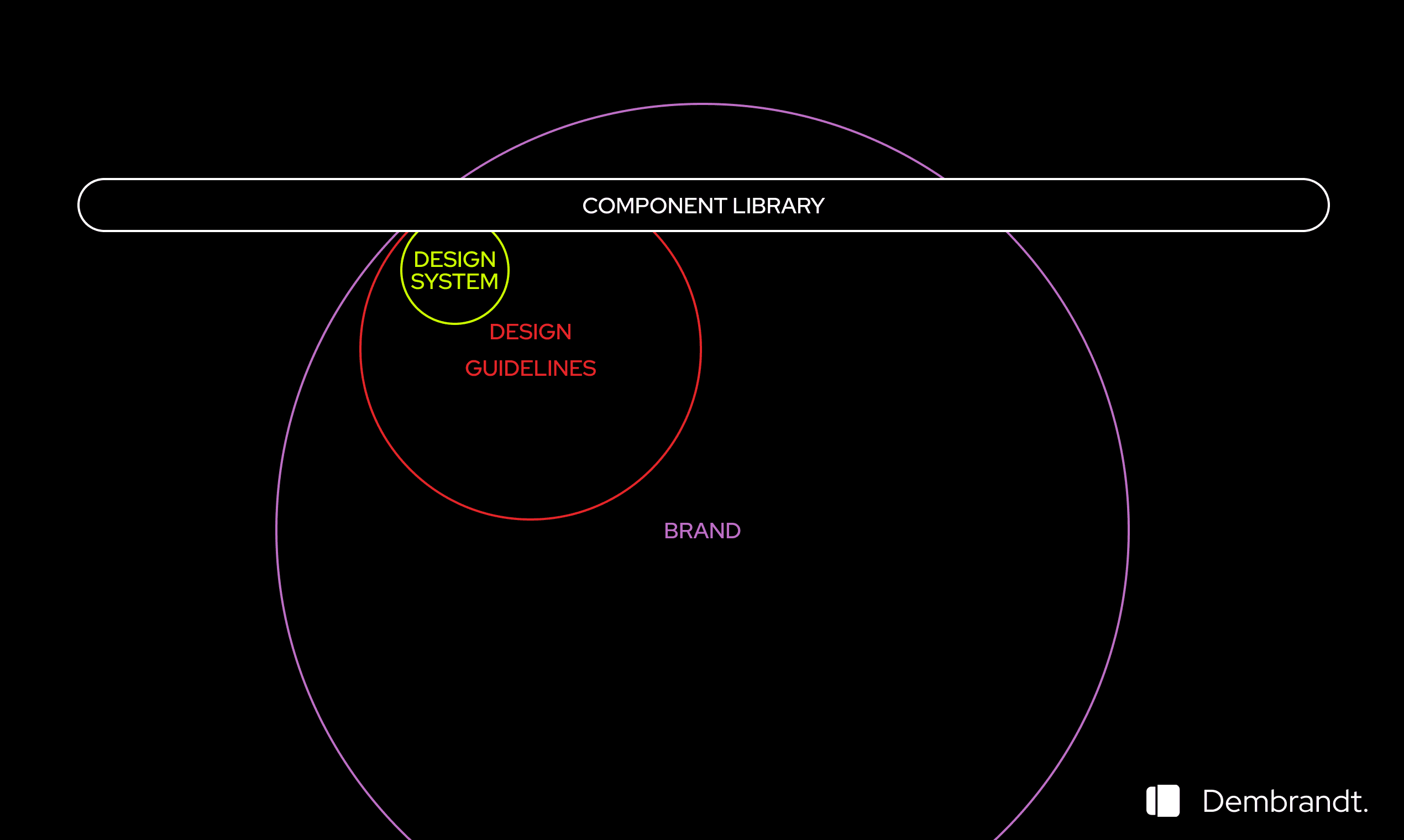
Brand perspective
Brand is the outermost layer - it predates every UI decision and lives in physical spaces, print, and events. Design guidelines narrow it to digital intent. The design system narrows it further to concrete, repeatable decisions. The component library implements those decisions in code, cutting across all three layers.
2.Who reads it brand-first
Marketing and brand leads live here. For them, the brand is the non-negotiable outer boundary. Everything else is execution. If a component library ships buttons in the wrong colour, that is not a technical debt issue - it is a brand violation. Their job is to protect the outermost circle, and they measure quality by how consistently every surface, digital or physical, reflects what the brand is supposed to say.
Traditional visual designers and creative directors share this reading. They came up through brand work, print, identity systems. To them, a design system is brand guidelines made machine-readable - useful, but derivative. The brand came first. The system follows from it. A component that is technically consistent but visually off-brand is still wrong, regardless of what the token says.
This instinct is valuable and often underestimated by digital teams. A designer who has truly internalized a brand can walk into a retail space, pick up a piece of merchandise, or look at a set of event graphics and make a quick, reliable call: does this feel like the brand or not? That judgment is pattern recognition, not opinion. The same instinct that catches a wrong button radius in a staging environment also catches a tote bag that does not belong to the same visual family as the homepage.
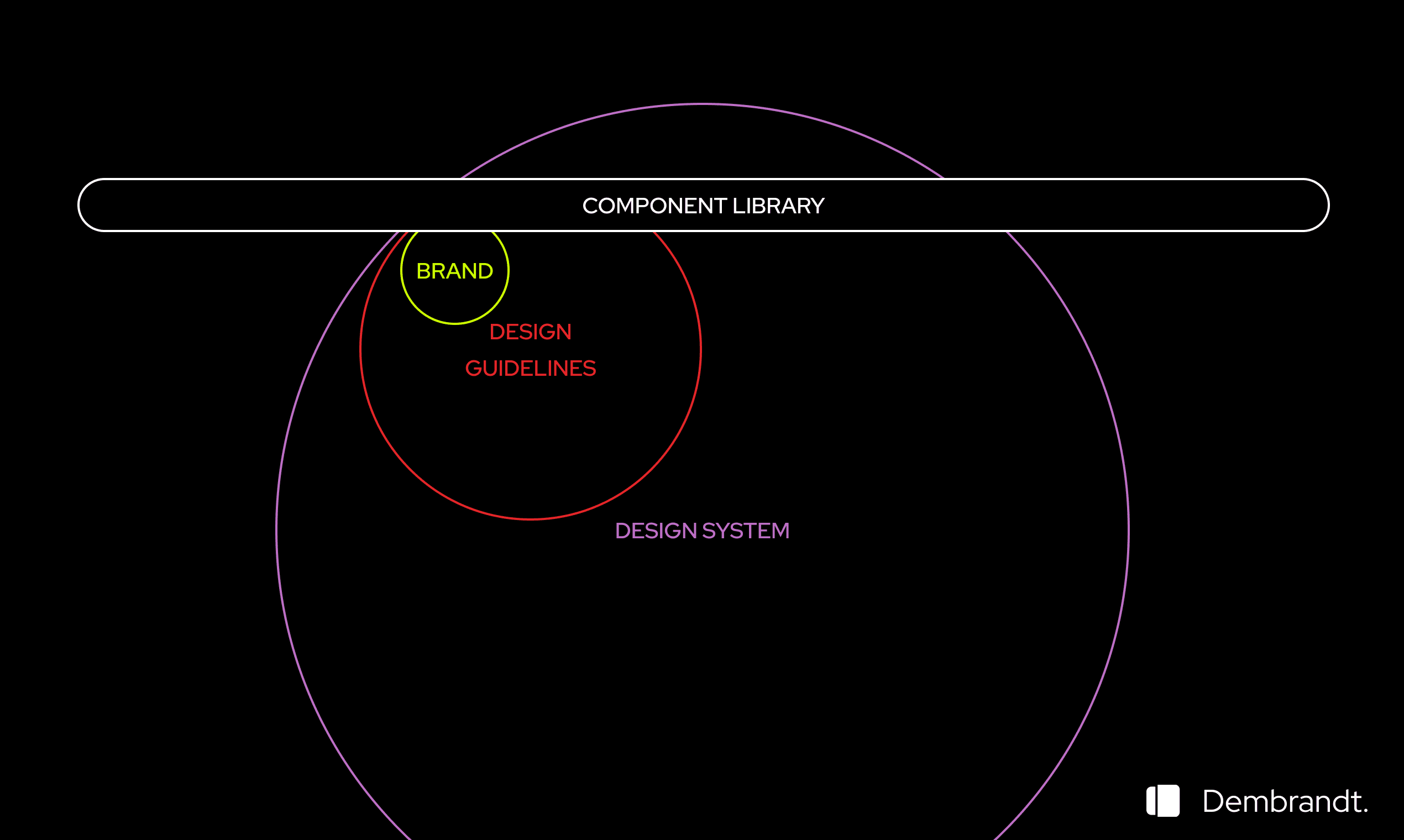
Engineering perspective
The design system is the broadest specification a developer works within. Brand is one of its inputs - a property of the system, not a wrapper around it. The component library is the concrete implementation that sits across all layers simultaneously.
3.Who reads it system-first
Frontend developers and design system engineers tend to invert the diagram. For them, the design system is the specification - the largest abstraction they actually work within. Brand is an input to that system: a set of colour tokens, a type scale, maybe a motion curve. Important inputs, but still inputs. The component library is the primary surface of their work. Whether a button is "on brand" is a question the design system should already answer - the developer should not have to hold that judgment themselves.
UI designers sit closer to this reading than most people expect. They work in components daily. Their Figma file is a component library. When they think about design decisions, they think in terms of the system - spacing tokens, type styles, component states. Brand identity is ambient context, not the active working layer. They know the brand; they just do not think in terms of it moment to moment.
4.The roles that live between both
Internal UX designers navigate both readings every week. They translate between the brand-first language of the marketing team and the system-first language of the engineering team. When a product feature needs a new pattern, they ask two questions simultaneously: does this fit the system, and does this fit the brand? When the answer to one is yes and the other is no, they are the person who has to resolve it. This is a harder job than either side tends to appreciate.
Product managers often hold neither reading explicitly but feel the tension between them more than anyone. When a brand team and an engineering team are blocked on a design decision, it usually lands on a PM's desk. They have no formal stake in which circle is outermost - they just need the team to ship. Understanding that the disagreement is a perspective conflict, not a factual one, is often what unblocks it.
5.The consultant's position: no home circle
External consultants and external UX designers arrive without a prior reading. This is both an advantage and a constraint. They cannot afford the luxury of a fixed perspective because their job is to work with whoever is in the room. A consultant who shows up with a firm brand-first worldview will immediately lose the engineering team. One who leads with system architecture will lose the creative director.
The practical challenge is orientation speed. Before a consultant can mediate between perspectives, they need to understand what the brand actually looks like in production - not in the brand guidelines PDF, which may be years out of date, but on the live site. What hex values are actually in use? Which typeface weights appear in the product versus the marketing site? Are the buttons consistent across checkout and the homepage?
Answering those questions used to mean opening DevTools on every page and copying values by hand. Running a tool like Dembrandt against a live URL returns the actual colour palette, type scale, and spacing rhythm as rendered in production - not as intended. The same extraction run across two surfaces from the same brand immediately surfaces divergence. That conversation used to take half a day. It now takes a prompt.
6.Naming your perspective is the first move
Most cross-functional design arguments are not about facts. The brand-first person and the system-first person are not disputing the same claim. They are describing different layers of the same structure from different vantage points, using the same words to mean different things. "Design system" means something different to a creative director than it does to a design system engineer. "Brand" means something different to a marketing lead than to a developer.
The first move in any productive cross-functional design conversation is to name which layer you are standing in. Not to win the argument about which layer is most important - they all are, from the right position - but to establish that you understand the others are standing somewhere else, and that somewhere else is also valid.
Design systems drift not because people make bad decisions, but because people with different perspective readings make locally coherent decisions that are globally inconsistent. A developer ships a component that passes system checks but breaks the brand feeling. A marketing team requests a brand update that is visually correct but architecturally incompatible with the component library. Neither is wrong. They are just reading from different circles.
The teams that stay coherent over time are the ones where someone - an internal UX lead, a design system owner, a lead consultant - holds both readings at once and translates between them continuously. That role is not glamorous. But it is the role that keeps the hierarchy from splitting into two separate systems that share a logo and nothing else.
The diagram is not a puzzle with one correct solution. It is a mirror. What you see as the outermost circle tells you more about your own working context than it does about the abstract relationship between brand and code. That is not a problem to solve. It is a fact to name - and once named, it becomes the starting point for a conversation that can actually go somewhere.
Related
Workflows That Pay Off
Modern design and development workflows are not about picking the fanciest tool. They are about shared understanding, a common end goal, and a workflow that fits the team you actually have.
Explorer
Design tokens extracted from well-known brands using Dembrandt.
CLI QuickstartGetting started
Install Dembrandt and turn any public website into a complete set of design tokens in under 2 minutes. All you need is Node.js and a terminal.