Overview
Code now ships at agent speed. A design system maintained by hand in Figma is stale by lunch, so the design system itself has to be built agentically: an agent reads the repositories, writes tokens and components into Figma, measures drift, and opens the pull requests, while the designer decides and checks. This is how to set that up: which artifacts to produce, how little guidance they need, where they are reviewed and versioned, and how a change reaches production.
1.What is in the design system
Build on a public foundation: Radix, shadcn, Tailwind and Lucide. None of that is worth reinventing. The part that is actually yours is how Figma, the token package and the repositories are wired together, and what the team does when they disagree.
| Artifact | In Figma | In code |
|---|---|---|
| Tokens | Variables: a primitive layer and a semantic layer, light and dark as modes | The same tokens as an npm package with semver and a changelog |
| Components | A library with variants, states and slots; each description names its code counterpart | Components built from the tokens, named as the Figma description says |
| Icons | One library, Lucide, as components | The same library, the same names |
| Project designs | One file per product surface, built from library instances only | One repository per surface, depending on the token package |
Each project file pulls the latest library version when it feels ready, not when the library is published. Code never reads a hex value that Figma does not know about.
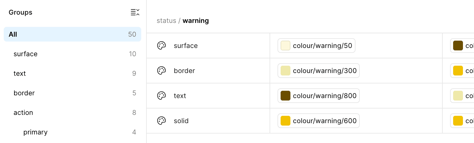
The semantic layer is where the meaning lives. A status tone is four aliases onto the primitive scale, and the mode swaps which end of the scale each alias points at. Nothing in a component ever names a primitive.
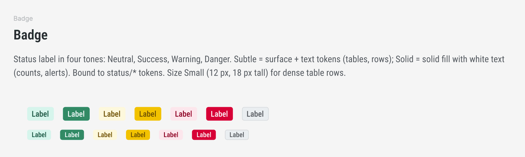
A component page is one paragraph. What the component is for, which tones and variants exist, which tokens it is bound to, and the one size that exists for dense rows. If the page needs more than that, the component is doing too much.
A good designer extends a brand guide into a design system in exactly this order. Define the base tokens first, somewhere versionable. Build reusable components from those tokens. Then, if you want to go far, combine components into patterns and layouts. Skipping the token step is how you end up with forty shades of grey and a component library nobody trusts.
2.How the artifacts get made
Every artifact above is produced by an agent, with a human approving. If the code side ships ten pull requests a day and the design side is hand-dragging rectangles, the two drift apart within a week. Producing the Figma side agentically keeps them in step, and quality components fall out of the process instead of needing a separate polish pass.
Let the agent read the repositories and write into Figma over MCP: create variables, build component sets, fill in descriptions, keep names aligned between the two worlds. The agent proposes, the human approves, and the approval is the actual design work.
Start from a blank file, and make the first page a drift page rather than a component. One per application, measuring how far each codebase sits from the design system, with Dembrandt producing the design diffs of the test environments against it. That page is the backlog: component by component, package by package, what still needs to move. When a line on it goes to zero, that component is done.
The component table on the same page is the other half of the backlog: what each codebase has, what Figma has, and whether the team has decided yet. Every row ends in a decision, and the agent works the rows that have one.

3.Guidance for agents and people
Keep it minimal. Every repository carries a short agent instruction file with a link to the design system and the changelog. Design principles get written down as one-line rules at the moment they are decided, so the guidance grows as a by-product of the work instead of as a documentation project. Language models already know how components combine. What they do not know is which decisions this team has already made, and that is the only thing worth writing down.
The temptation is to write a long usage guide. Resist it. A long guide needs maintaining, and the first time it drifts from the library it becomes worse than nothing. Trust the component descriptions, the token names and the changelog to carry the meaning.
User journeys do not belong in the design system. They live in the project design files, next to the screens they describe.
4.Where it is visible, how it is reviewed, how it is versioned
Comments go on the component, in Figma, not in a separate thread. The thing being discussed and the discussion stay together, and the agent can read both when it picks the component up next.
Every page carries a status mark: edited awaiting review stable, red during the session, yellow after it, green on explicit request, with the date of the last change in the page name. The mark changes in the same edit as the content, so nobody has to ask what is safe to build on.
A release is the token package semver. A design system version is a published package with a changelog line, not a Figma branch name. When someone asks which version an app is on, the answer is in its lockfile.
People need a place to look. A public components page, in the style of components.yourcompany.com, built with Storybook, VitePress or a custom site, whatever fits. Everyone in the company should be able to open it and see what exists. Agents get the same library over MCP. A modern agentic tool does not need a pinned version in its own codebase. It needs the latest one, reachable.
5.How a change reaches production
- 1Figma changeVariables or a component set change, with the page marked edited.
- 2Token packageA new semver publishes with a changelog line.
- 3One pull request per appDependency bump, build and tests green, checked in a browser.
- 4Test environmentThe pull request deploys where the drift scan can see it.
- 5Drift measurementThe scan shows whether the gap closed, as a point on the drift page.
- 6ProductionMerged, and the page turns stable.
No handoff meeting. The drift page is the handoff. Run well, this loop produces a handful of pull requests across several applications in a working day.
6.What the infrastructure side looked like
Design decisions live in Figma. Everything else lives in repositories and pipelines, and most of it is not glamorous. It is the groundwork that makes the loop above possible at all.
Framework debt comes first. Before a single token lands, every application has to sit on the same Tailwind major, with the dependencies nothing imports removed (duplicate Radix versions are the usual find) and the icon sets unified. A design system cannot sit on two different versions of its own foundation, and an agent will happily build on whichever one it reads first.
The work ships as small, independent pull requests, one concern each, each with its own manual test note. Every branch gets its own git worktree, so unfinished work on other branches stays untouched and the agent can run builds and tests in parallel without stepping on anyone. The only ordering constraint worth having is when two branches touch the same global stylesheet, and then one gets rebased. Cleanup after merge is one command.
The tokens live in the organisation package feed. The design system repository publishes, the applications depend, and the drift scan reads the installed version to know what it is measuring against. Icons go into Figma in bulk, the whole set as components in one go. The MCP server cannot fetch from the network, so the agent builds an SVG sheet locally, uploads it, and converts groups to components in batches of a few hundred. Larger batches drop the connection.
The drift scan is the number that makes all of this worth doing. Expect colours outside the token set to drop by a large fraction on the first day, and plot that as a point on the Figma drift page.
7.Early observations from a fully agentic setup
Voice works for design.
Driving the agent by speech while looking at Figma is a natural way to make design decisions. The hands stay off the mouse, the eyes stay on the canvas.
Release notes and pull requests can follow a Figma publish automatically.
The publish is the event, and it happens many times a day, since project files only see changes after it. Everything downstream of it is mechanical and the agent can do it.
Drift and component values are documentation.
Measured design drift across codebases and the actual values of each component can be written by the agent into Figma, a wiki, wherever people read. Hand-written documentation of the same thing goes stale on day one.
The frontend framework stops mattering.
Two codebases on two different frameworks, and the same instructions produce the same result in both. Agentic instruction makes the framework an implementation detail.
8.Lessons from a library that already shipped
An earlier component library, built by hand on a different stack, went through the same stages. Its history is a preview of what the agentic one will hit.
Tokens first paid off. With a primitive to semantic layer from day one, every later component and every app-specific style could lean on variables instead of values. What did not come for free was Figma parity: a large share of all commits were "match Figma" fixes. A Figma link on every documentation page made the comparison routine. The drift measure is the automated version of that habit, and Code Connect is the next step.
Real data changes the API. The first content-heavy component changed shape the moment real backend data arrived. Draft status and alpha releases exist for exactly this: try the component against a real application before the API is called stable. An app-local component built from library tokens is the same signal from the other side: it names the next library component.
Distribution is a product of its own. Most of one month went into how the library reaches applications, not into new components: a package name, an exports map, built ESM and types, a private registry, CI publish, and an MCP server that installs and checks the version in one call. Agents are consumers too, and metadata read from the human documentation keeps their instructions the same truth as the docs instead of a second document that drifts.
Two smaller decisions turned out to matter more than expected. Icons are three things: interface icons, third-party logos and domain-specific pictograms each got their own component, and the split clarified both Figma and code. And class or component has to be decided and written down. CSS classes work in any markup, components bring a props API, and in the first consuming app the classes quietly outnumbered the components for the same element because nobody had chosen.
9.When it counts as done
Not at the first library publish. A design system is proven when developers who did not build it stop asking questions about it, after a few weeks of daily use. Until then it is a prototype with good intentions, and opening it up, inside the company or beyond, should wait for that point.
Not sure where to start?
The drift page in section two is the first thing to build, and it needs a baseline. A fixed-price design system audit of your live site gives you that baseline and the backlog in two working days.
Start with the auditContinue reading
Design-Dev Workflows That Pay Off
Modern design and development workflows are not about picking the fanciest tool. They are about shared understanding, a common end goal, and a workflow that fits the team you actually have.
Token Drift Is Silent. Here Is How to Catch It.
Design tokens drift quietly between releases. A color shifts, a spacing value disappears, a border radius changes. Nobody notices in the moment. Here is how a baseline-based approach catches it before it compounds.
The Agentic Pipeline: From Ticket to Production in 2026
Every product team runs the same journey from intent to a live experience. This is that journey in plain terms, the eight stages from planning to learning, and where an AI agent now sits inside each one.